Flex 布局的概念
Flex 是 Flexible Box 的缩写,意思就是“弹性布局”。它的作用就是为盒状模型提供最大的灵活性。
任何容器都可以指定为Flex 布局.
1 | .box { |
行内元素也可以使用flex 布局
1 | .container { |
注意: 设置为Flex布局之后, 子元素的·float,claer,vertical-align 将会失效。
Flex的基本概念
使用了Flex布局的元素, 称为:Flex容器, 简称:“容器”。 容器内的所有元素自动成为容器成员。称为:Flex项目, 简称“项目“。
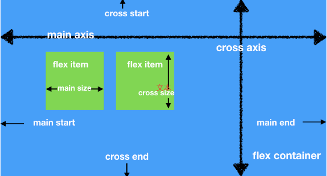
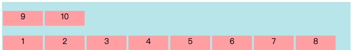
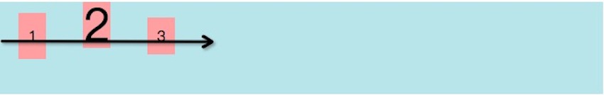
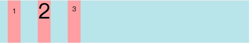
容器默认存在两根轴,水平的主轴(main axis)和垂直的交叉轴(cross axis),主轴的开始位置(与边框的交叉点)叫main start, 结束位置叫main end交叉轴的开始位置叫cross start, 结束位置叫cross start。
项目默认沿主轴排列。单个项目占据的主轴空间叫main size, 占据的交叉轴空间叫cross size。
容器的属性
一共有6 个属性是可以设置在容器上。
- flex-direction
- flex-wrap
- flex-flow
- justify-content
- align-items
- align-content
flex-direction 属性
flex-direction 决定主轴的方向(项目的排列方向)。
1 | .container{ |
flex-direction的4个值的含义:
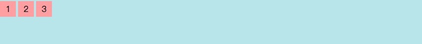
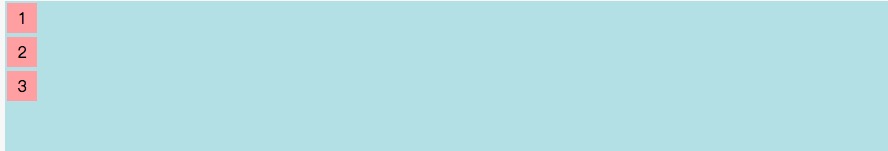
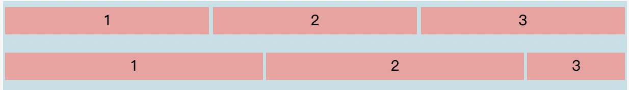
row:默认值,主轴为水平方向,起点在左端。
1
2
3
4
5
6
7
8
9
10
11
12
13
14
15
16.container {
width: 100%;
height: 400px;
background: #54b4c557;
display: flex;
flex-direction: row; // 默认值,主轴为水平方向,起点在左端
}
.item {
background: #f19f9e;
width: 30px;
height: 30px;
text-align: center;
line-height: 30px;
margin: 2px;
}
完整 Demo
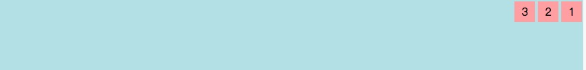
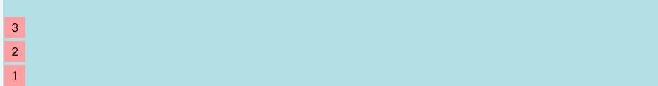
row-reverse:主轴是水平方向,起点在右端
1
2
3
4
5
6
7
8
9
10
11
12
13
14
15
16.container {
width: 100%;
height: 400px;
background: #54b4c557;
display: flex;
flex-direction: row-reverse; // 主轴是水平方向,起点在右端
}
.item {
background: #f19f9e;
width: 30px;
height: 30px;
text-align: center;
line-height: 30px;
margin: 2px;
}
完整 Demo
column:主轴为垂直方向, 起点在上沿
1
2
3
4
5
6
7
8
9
10
11
12
13
14
15
16.container {
width: 100%;
height: 400px;
background: #54b4c557;
display: flex;
flex-direction: column; // 主轴为垂直方向, 起点在上沿
}
.item {
background: #f19f9e;
width: 30px;
height: 30px;
text-align: center;
line-height: 30px;
margin: 2px;
}
完整 Demo
column-reverse:主轴是垂直方向,起点在下沿
1
2
3
4
5
6
7
8
9
10
11
12
13
14
15
16
.container {
width: 100%;
height: 400px;
background: #54b4c557;
display: flex;
flex-direction: column-reverse; //主轴是垂直方向,起点在下沿
}
.item {
background: #f19f9e;
width: 30px;
height: 30px;
text-align: center;
line-height: 30px;
margin: 2px;
}
完整 Demo
flex-wrap 属性
默认情况下,所有的项目都排列在一条线上(又称为“轴线“). flex-wrap属性定义, 如果在一条轴线上排不下, 如何换行。
1 | .container { |
flex-wrap的3个值的含义:
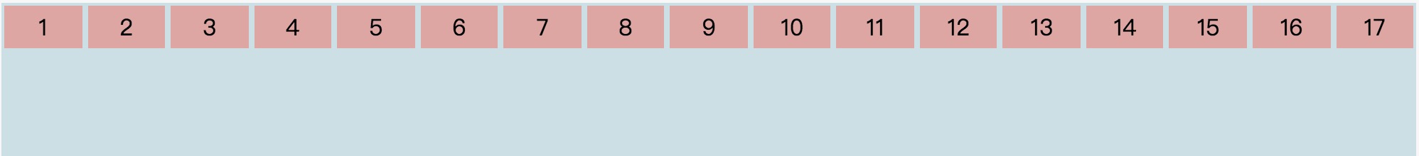
nowrap: 默认值,不换行
1
2
3
4
5
6
7
8
9
10
11
12
13
14
15
16
.container {
width: 100%;
height: 400px;
background: #54b4c557;
display: flex;
flex-wrap: nowrap: // 默认值,不换行
}
.item {
background: #f19f9e;
width: 100px;
height: 30px;
text-align: center;
line-height: 30px;
margin: 2px;
}
完整 Demo
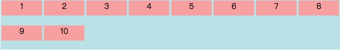
wrap:换行, 第一行在上方
1
2
3
4
5
6
7
8
9
10
11
12
13
14
15
16
.container {
width: 100%;
height: 400px;
background: #54b4c557;
display: flex;
flex-wrap: wrap; // 换行, 第一行在上方
}
.item {
background: #f19f9e;
width: 100px;
height: 30px;
text-align: center;
line-height: 30px;
margin: 2px;
}
完整 Demo
wrap-reverse:换行, 第一行在下方
1
2
3
4
5
6
7
8
9
10
11
12
13
14
15
16
.container {
width: 100%;
height: 400px;
background: #54b4c557;
display: flex;
flex-wrap: wrap-reverse; // 换行, 第一行在下方
}
.item {
background: #f19f9e;
width: 100px;
height: 30px;
text-align: center;
line-height: 30px;
margin: 2px;
}
flex-flow 属性
flex-flow 属性是 flex-direction属性 和 flex-wrap属性的简写形式。默认值:row nowrap
1 | .container { |
justify-content 属性
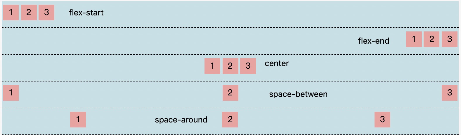
justify-content属性定义了项目在主轴上的对齐方式。
1 | .container { |
justify-content属性有5个值:
- flex start: 默认值,主轴的起点对齐
- flex-end: 主轴的终点对齐
- center:居中
- space-between:两端对齐,项目之间的间隔是相等的
- space-around: 每个项目两侧的距离相等,所以项目之间的间距与项目与边框的间距要大
1 | .container { |
完整Demo
align-items 属性
align items 属性定义项目在交叉轴的对齐方式,
1 | .box { |
一共有5个值:
flex start:: 交叉轴的起点对齐
1
2
3
4
5
6
7
8
9
10
11
12
13
14
15
16.container {
width: 100%;
height: 400px;
background: #54b4c557;
display: flex;
align-items: flex-start; // 交叉轴的起点对齐
}
.item {
background: #f19f9e;
width: 100px;
height: 50px;
text-align: center;
line-height: 50px;
margin: 2px;
}
完整 Demo
flex end: 交叉轴的终对齐
1
2
3
4
5
6
7
8
9
10
11
12
13
14
15
16
.container {
width: 500;
height: 400px;
background: #54b4c557;
display: flex;
align-items: flex-end; // 交叉轴的终点对齐
}
.item {
background: #f19f9e;
width: 30px;
height: 30px;
text-align: center;
line-height: 30px;
margin: 2px;
}
完整 Demo
center:居中
1
2
3
4
5
6
7
8
9
10
11
12
13
14
15
16
.container {
width: 100%;
height: 400px;
background: #54b4c557;
display: flex;
align-items: center; // 居中
}
.item {
background: #f19f9e;
width: 30px;
height: 30px;
text-align: center;
line-height: 30px;
margin: 2px;
}
完整 Demo
baseline: 项目的第一行文字基线对齐
1
2
3
4
5
6
7
8
9
10
11
12
13
14
15
16
17
18
19
20
21
22
23
24
25
26
27
28
29
30.container {
width: 100%;
height: 100px;
background: #54b4c557;
display: flex;
align-items: baseline
}
.item1 {
background: #f19f9e;
width: 30px;
text-align: center;
line-height: 50px;
margin: 0 20px;
}
.item2 {
width: 30px;
font-size: 50px;
background: #f19f9e;
text-align: center;
line-height: 50px;
margin: 0 20px;
}
.item3 {
width: 30px;
background: #f19f9e;
text-align: center;
line-height: 40px;
margin: 0 20px;
}
完整 Demo
stretch: 默认值, 如果项目未设置高度或者设置高度为auto,将铺满整个容器的高度
1
2
3
4
5
6
7
8
9
10
11
12
13
14
15
16
17
18
19
20
21
22
23
24
25
26
27
28
29
30.container {
width: 100%;
height: 100px;
background: #54b4c557;
display: flex;
align-items: strecth; // 默认值, 如果项目未设置高度或者设置高度为auto,将铺满整个容器的高度
}
.item1 {
background: #f19f9e;
width: 30px;
text-align: center;
line-height: 50px;
margin: 0 20px;
}
.item2 {
width: 30px;
font-size: 50px;
background: #f19f9e;
text-align: center;
line-height: 50px;
margin: 0 20px;
}
.item3 {
width: 30px;
background: #f19f9e;
text-align: center;
line-height: 40px;
margin: 0 20px;
}
完整 Demo
align-content 属性
align-content属性设置了多根轴线的对齐方式,如果项目只有一根轴线,那么该属性是不生效的。
1 | .box { |
该属性一共有6 个属性值:
- flex start:: 交叉轴的起点对齐
- flex end: 交叉轴的终对齐
- center:居中
- stretch: 默认值, 如果项目未设置高度或者设置高度为auto,将铺满整个容器的高度
- space-between:与交叉轴两端对齐,轴线之间的间隔平均分布
- space-around:每根轴线两侧的间隔都相等。所以,轴线之间的间隔比轴线与边框的间隔大一倍
- stretch:默认值,占满整个容器
注意: align-items 属性和align-content属性的区别:align-items属性是设置多根轴线和单根轴线的, align-content属性是设置多根轴线的。这里的多根轴线和单根轴线是指flex-wrap:nowrap是单根轴线,align-items 和align-content同时存在的话, align-items 生效,align-content 不生效。flex-wrap:wrap| wrap-reverse 且项目换行了,align-items 和align-content同时存在的话, align-items 不生效,align-content 生效。
例子如下:
1 | .container { |
完整的 Demo
项目的属性
以下6个属性设置在项目上。
orderflex-growflex-shrinkflex-basisflexalign-self
order 属性
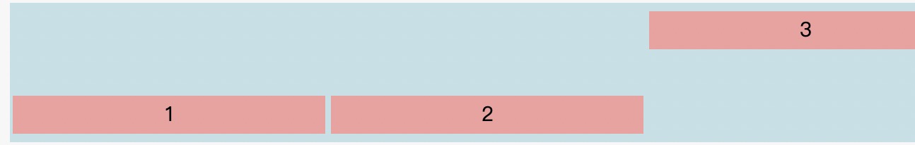
order 属性定义项目的排列顺序,数值越小,排列越靠前, 默认值为0。
使用语法:
1 | .item { |
例子:
1 | .container { |

flex-grow 属性
flex-grow属性定义项目的放大比列。默认为0,即 即使存在剩余空间, 也不放大。
使用语法:
1 | .item { |
例子:
1 | .container { |

如果所有项目的flex-grow属性都为1,则它们将等分剩余空间(如果有的话)。如果一个项目的flex-grow属性为4,其他项目都为1,则前者占据的剩余空间将比其他多4倍。
flex-shrink 属性
flex-shrink属性定义项目的缩小比例,默认值为1, 如果剩余空间不足,项目将缩小。
使用语法:
1 | .item { |
例:子
1 | .container { |
如果所有项目的flex-shrink属性都为1,当空间不足时,都将等比例缩小。
如果所有项目的flex-shrink属性都为1,其他的flex-shrink 为10,那么后者的缩小比例是前者的10倍
如果一个项目的flex-shrink属性为0,其他项目都为1,则空间不足时,前者不缩小。
负值对该属性无效。
flex-basis 属性
flex-basis属性定义在分配剩余空间之前, 项目占主轴的空间。浏览器根据这个属性,计算主轴是否有多余空间。它的默认值为auto,即项目的本来大小
使用语法:
1 | .item { |
例子:
1 | .container { |

flex属性
flex属性是flex-grow flex-shrink flex-basis 的简写,默认值为0 1 auto。后两个属性可选。
使用语法:
1 | .item { |
该属性有两个快捷值:auto (1 1 auto) 和 none (0 0 auto)。
建议优先使用这个属性,而不是单独写三个分离的属性,因为浏览器会推算相关值。
align-self 属性
align-self属性允许单个项目与其他项目不一样的对齐方式,可覆盖align-items,默认值为auto,表示继承父级的align-items。如果没有父元素,则等同于stretch。
该属性可能取6个值,除了auto,其他都与align-items属性完全一致。
使用语法:
1 | .item { |
例子:
1 | .container { |